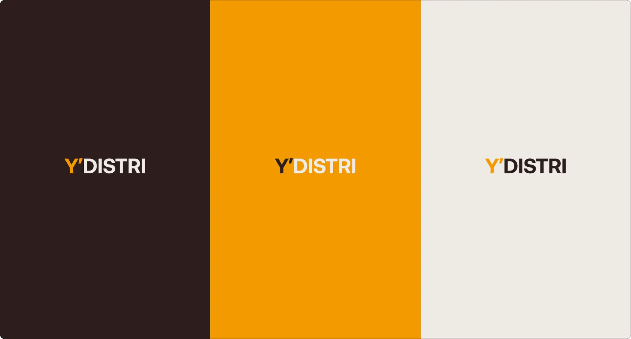
Together with Martin Janek, we recognized that our original visual design lacked uniqueness and had several shortcomings. Our joint mission was to enhance the clarity of the brand name YDISTRI, leading us to introduce an apostrophe into the design. Moreover, Martin and I sought to infuse the brand with an emotion that mirrors our ambition to be at the forefront of software solutions, improving upon the top replenishment systems in the market.
In 2023, we elevated our game to a new level, introducing a striking visual transformation that reflected our heightened aspirations. This pivotal change set the stage for Y's mission to redefine the retail landscape.
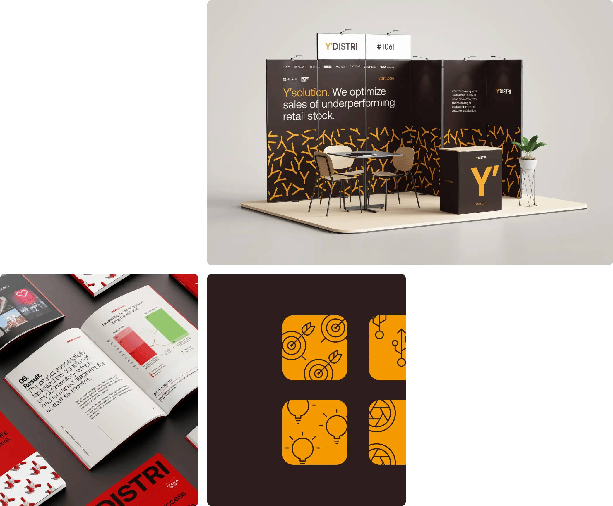
Our strategy focuses on boosting the sales of underperforming retail stock, ensuring that our visual identity revamp is in complete harmony with our vision.
Apostrophe
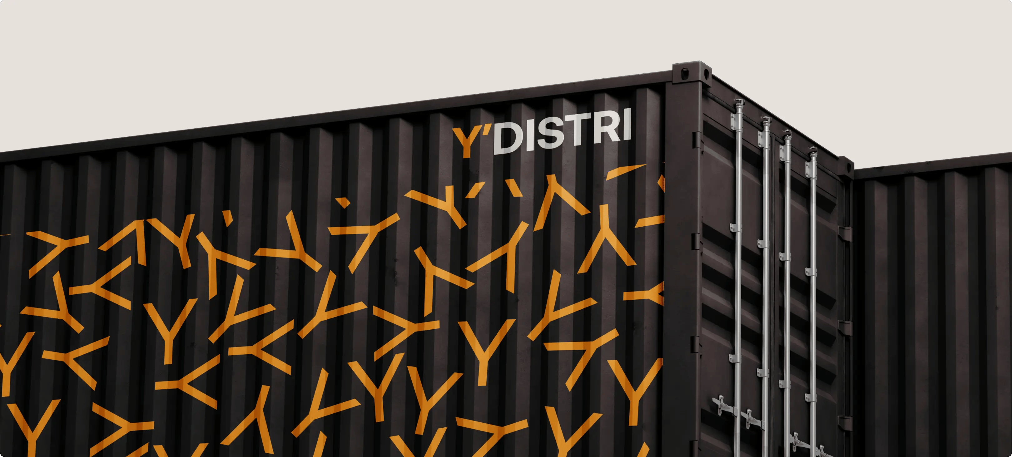
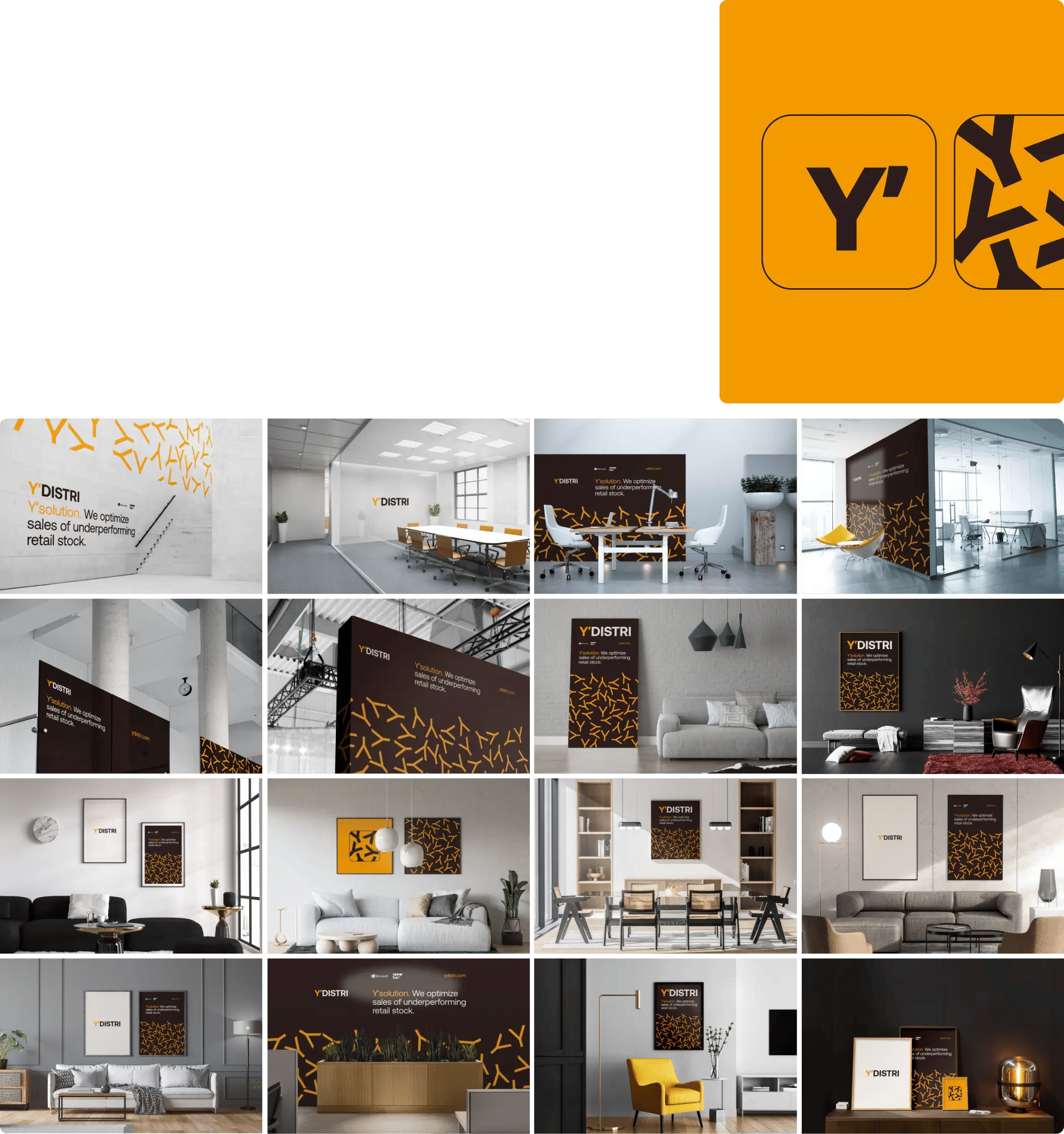
The apostrophe symbol is central to our brand identity, signifying the importance of "Y", which represents us and our solutions. We’ve made "Y" the focal point of our visual design, attributing to it specific qualities and characteristics. This approach is straightforward yet refined, ensuring that every element is purposeful and polished, with no excess.
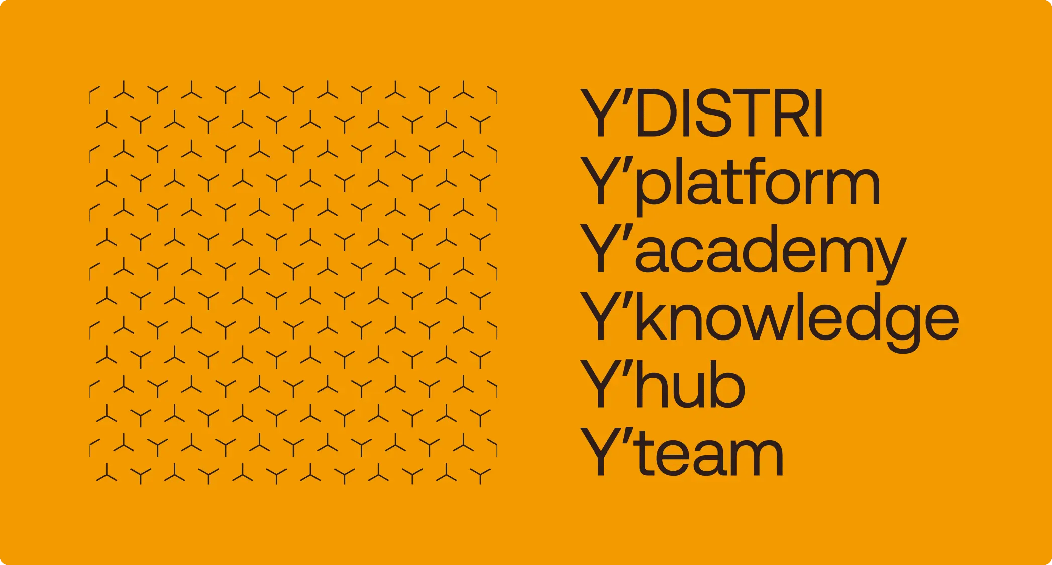
Using this simple principle also gave us the logo. Nothing more is needed.
Typography
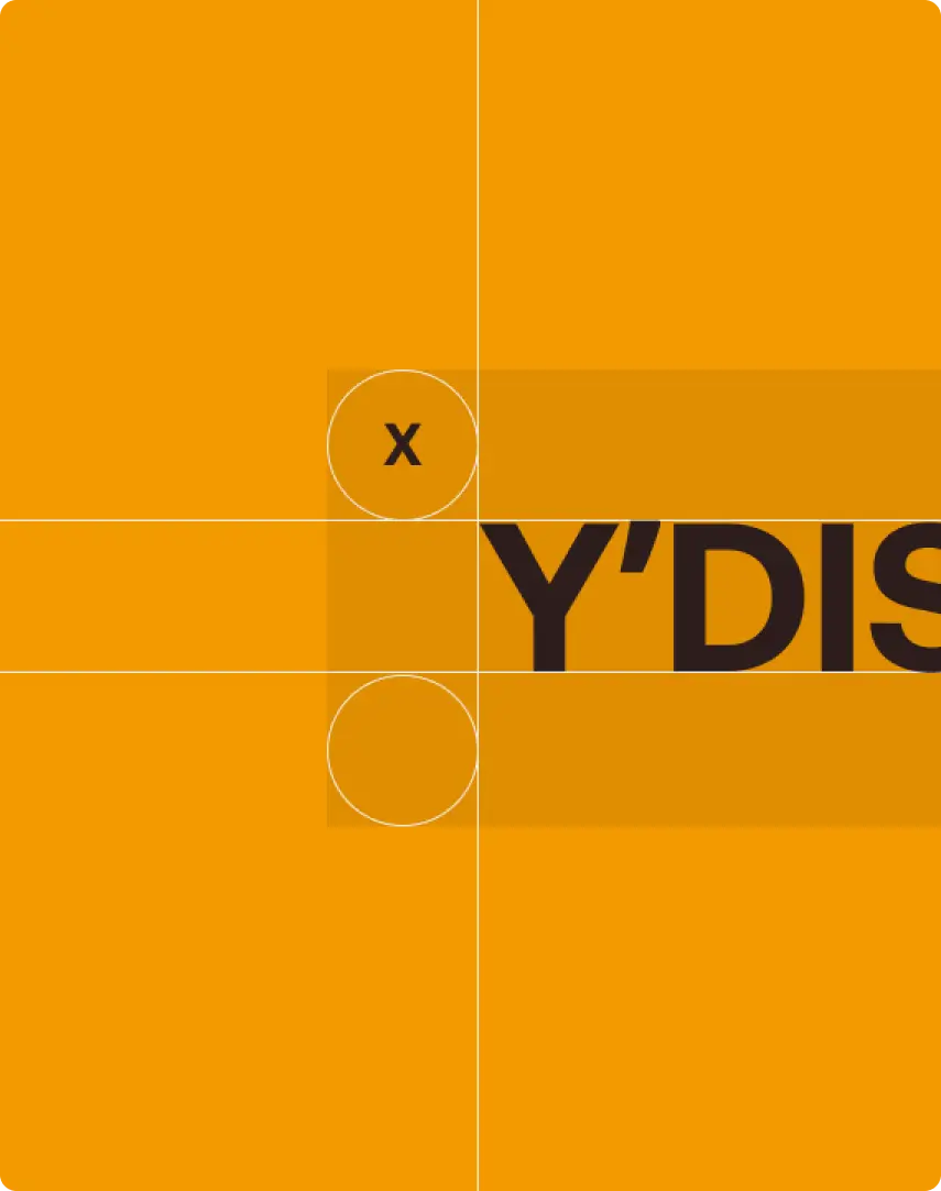
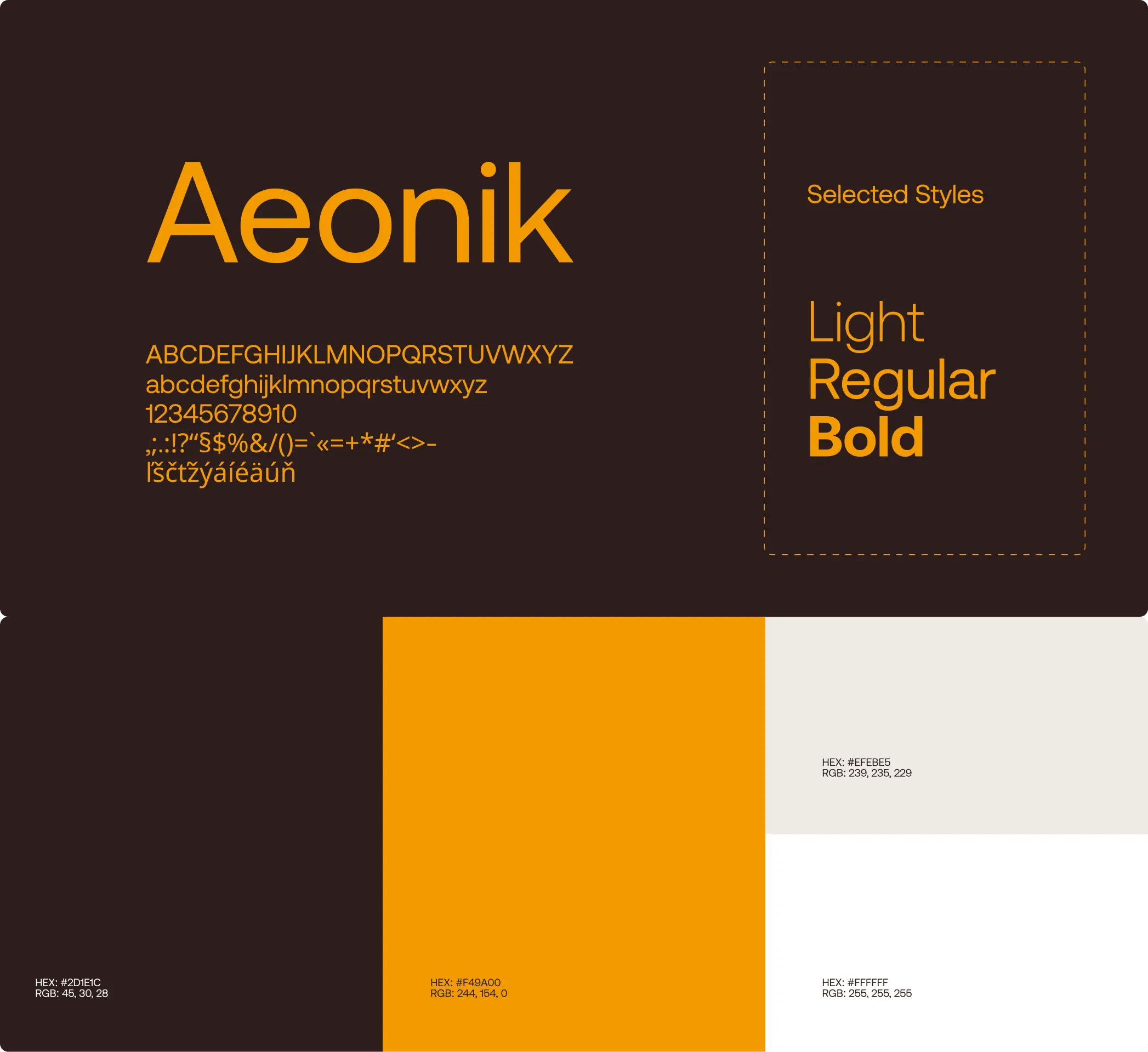
For our typography, we selected Aeonik as our corporate font. It’s a clean and straightforward Swiss font that we use across all our materials, including our logo, headlines, and body text.
Images
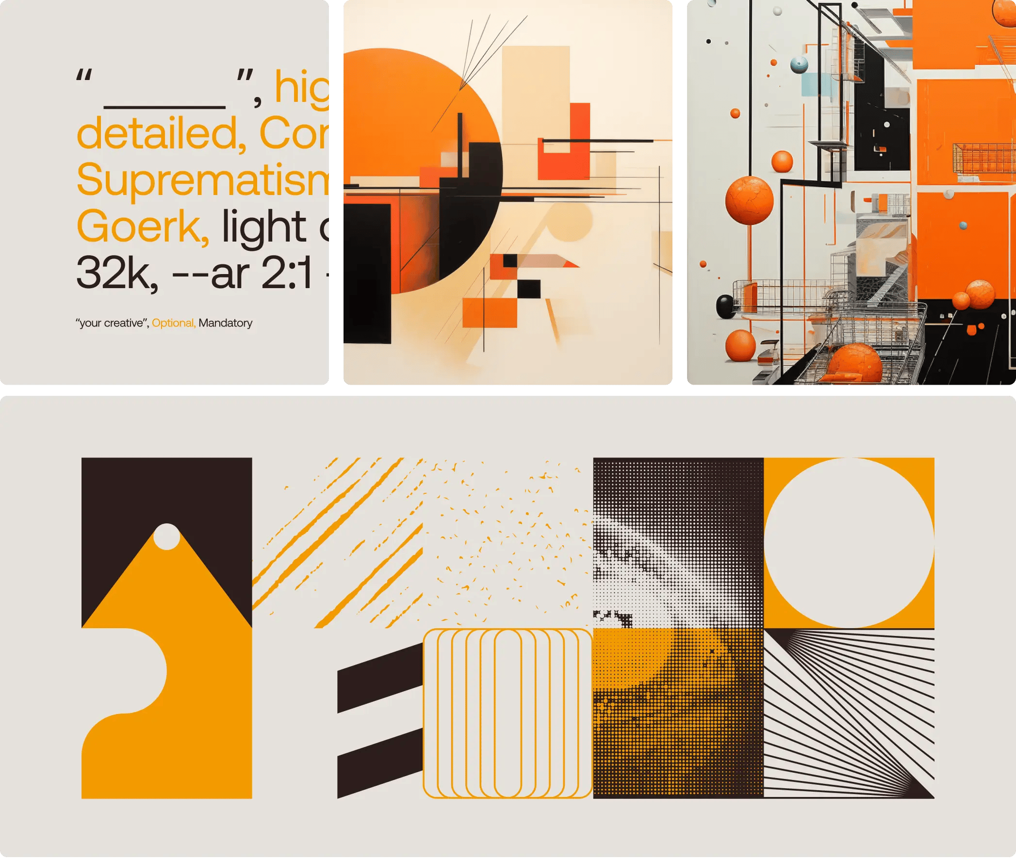
For our visuals, we’ve chosen to use images created by artificial intelligence (AI). To ensure these AI-generated images maintain a consistent appearance while also conveying our intended message, it’s crucial to have a combination of elements that remain constant and elements that can change within each image.
Y′team
We take pride in having a friendly and supportive environment, where you matter and your voice is heard. We are open-minded, proactive, thinking outside the box, and providing proactive feedback regularly. We support diversity and we appreciate every single employee in our company because one for all and all for one.
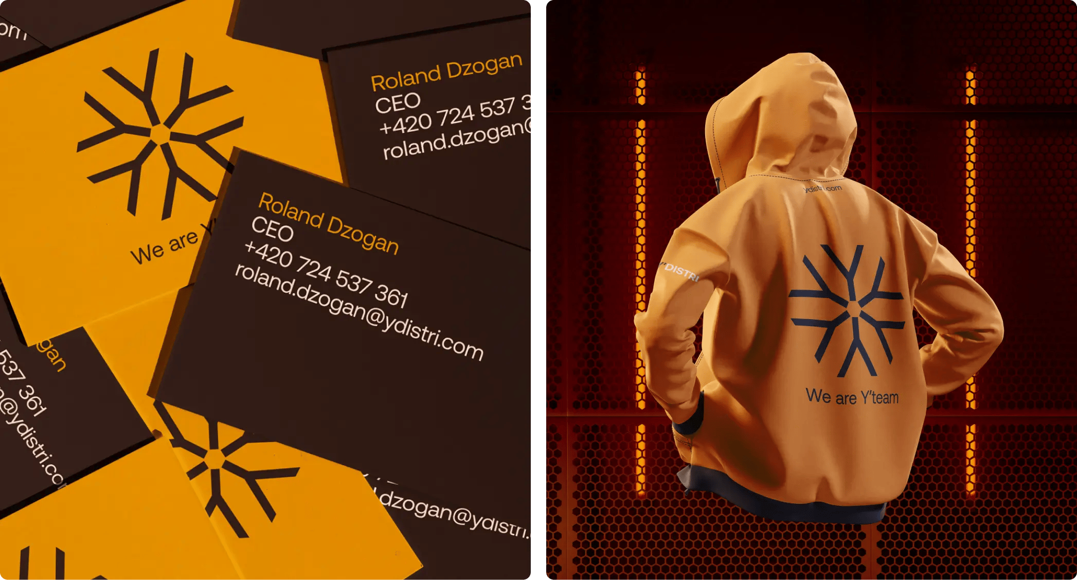
We have special symbol for Y'DISTRI team. This symbol we use for team activities and communication. It represent people of Y'DISTRI. This symbol represents the unity and cooperation of the team.
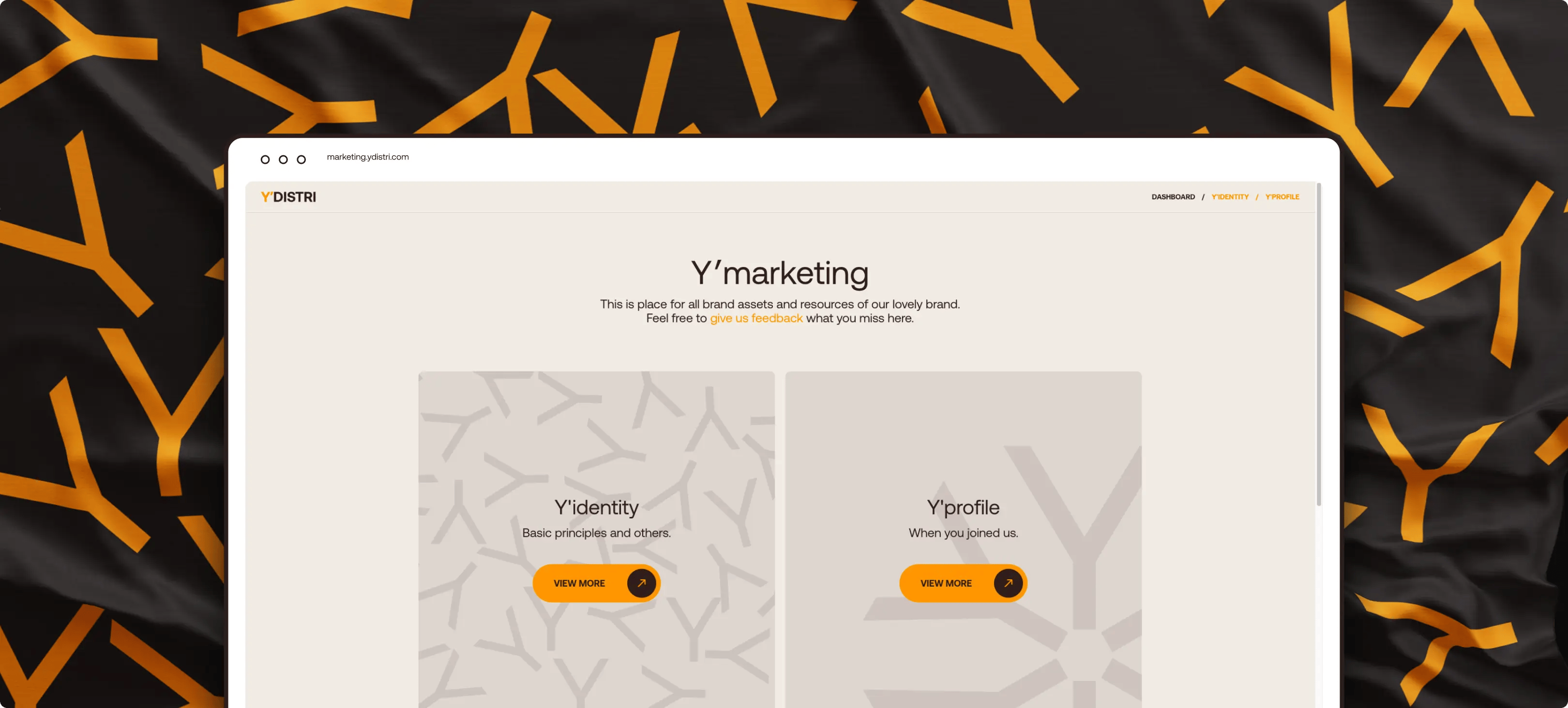
Y′marketing
Y′marketing is our central tool designed with precision to provide employees with easy access to all essential information and resources. It covers aspects of corporate identity, social media and more, functioning like our company’s marketing wiki. It serves as the definitive source of truth for our organization.
I'm really happy with our new corporate identity. It’s simple, clean, and modern – just what we were aiming for. It feels right for our brand.
Roland Dzogan, CEO
What we achieved with the redesign:
- Move away from the generic visual approach.
- Elevate the brand’s position, aiming for a more premium perception, reflecting our evolution from merely an application to a comprehensive service provider.
- Address the legibility issues of "YDISTRI" in the logo, along with concerns about the specific shade of orange used.
- Establish clear guidelines for various aspects including the brand’s emotional appeal, principles of visual communication, our Mission and Vision, Values, Brand story, and recruitment messaging.